What’s the worst possible way you could start off a new company or endeavor? With boilerplate, ugly branding. Want to just throw a globe or an abstract human form next to some haphazardly laid out type? Throw in some empty platitudes in your copy? Congrats – you look completely generic and forgettable.
We don’t do that here.
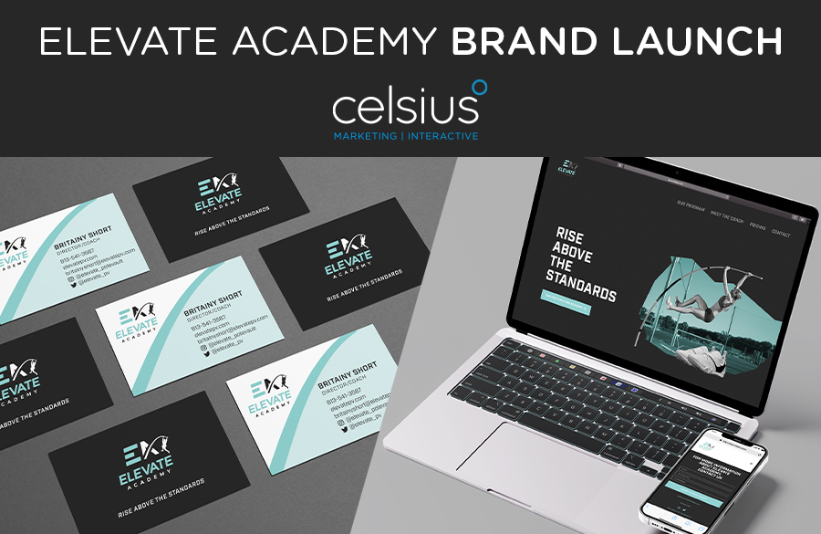
Let us present: Elevate Academy, a brand-new pole-vaulting academy in Alabama. We took on the challenge of creating this company’s identity from the ground up: logo, brand messaging, print collateral, and website.
Logo
Creating the logo was a collaborative process within the creative team. We explored different icons, typography, and layouts to land on a design that expresses the youthfulness, athleticism, and excitement that Elevate Academy will bring to its participants. The logo and overall aesthetic reflect movement and motion, something vital to pole-vaulting and agility. The client picked out the color scheme, and we dig it. The teal color resonates well with sports-centered designs and appeal to a gender-neutral audience.
Brand Voice & Messaging
In establishing a brand voice, inspiration was founded on the idea of “tough love” coaching and gritty honesty, something we think will appeal to a younger audience, one that can sniff out inauthenticity easily. To support those ideas, we wanted the voice and messaging to feel youthful, fun, and inspirational without becoming kitschy and too sentimental. We created a document full of headlines and quotes that can be used later and quickly pulled out for future projects!
Print Collateral
The print collateral became an extension of the brand. The curvature of the pole vaulter in the logo was used as a design element in both the business cards and rack cards. We also used a minimalist design to place the focus on the content.
Website
Knowing that the audience will be a younger demographic, we focused on the website being both slick and dynamic.
Slick: We organized the content to scroll along just one page. The viewer never has to leave this one page to get all the information they could need. Each section slides seamlessly into the next, all on a near-black background that’s easy on mobile eyes.
Dynamic: Having concise, legible information is one thing, but it still has to look nice. We incorporated moving, layered images to reflect the movement one can expect out of a pole-vaulting academy. These athletes will be on the move, and the website reflects that.
Building a brand’s identity from scratch is exciting, and as a team, we all love the feeling of seeing all the components of a brand come together cohesively. This brand identity project really gave us a chance to showcase all of our capabilities – from logo design and copywriting to print layout and web design – everything we do successfully and succinctly.
Your brand deserves better than a templated, unoriginal logo and voice. Are you looking to start from scratch? How about refreshing your old, ugly logo (don’t worry, we’ll be brutally honest)? Our team has more than 60 years of combined marketing experience, and we bring a different degree of thinking to every project we tackle. Check out our work to see how we’ve helped our clients elevate their brands and drive measurable results!